There are thousands of stocks, so it’s difficult to spend a lot of time trying to pick the best ones. Having a system to quickly tell if a specific stock looks interesting or not can help us a lot. Here is how I do this.
I start by adding the Harmonic Scanner and Harmonic Predictor to the chart. That way, when I switch to a specific stock I immediately see:
- Is there a harmonic pattern that formed recently?
- Is there a chance for a harmonic pattern in the future?
Only when one, or even better - both of those conditions are true, I take a closer look.
The interval depends on how much time I have. Most of the time, I’m not a day-trader. I have other job that I enjoy and most of my investments are long-term. From time to time I might have more time and then I do some day trades. So I usually use the 1D time interval. But for day-trading I switch to 1H or even 30-minutes.
The best time for me to buy stocks is right after a harmonic pattern showed up and there is a chance for another one in the opposite direction. I also prefer opening long positions and almost never short-sell. The last couple of years have been bad for short-selling stocks, especially if you mostly trade stocks from S&P500, but it might change in the future. One important assumption that I make is that I don’t trade against the trend. If there is a chance for a correction, that’s fine, but if the Harmonic Predictor suggests that the price might suddenly drop by 50% after 3 years of going up, I ignore that prediction.
Once I have that, I perform other technical analysis actions. I check for Fibonacci clusters, draw Andrew’s pitchfork and trend lines. I check candle formations and trend formations. If more tools support the initial harmonic patterns, then I open a position.
Choosing the right interval
The interval I use depends on how frequently I want to trade. I usually don’t have time to follow the charts for the whole day. And even if I had, that’s not the job I want to do for living. So most of the time I use the daily interval, but there are some days when I have more time and then I use the hourly charts.
Typically I start by opening 3 synchronized charts (this requires a paid TradingView account):
- A weekly one - to determine the general direction of the trend.
- A daily one - to spot harmonic patterns and perform the rest of the technical analysis.
- An hourly one - to find a good place for opening a position.
The higher the interval, the stronger the signals. Harmonic pattern or a trend line that is visible on a weekly interval is a much stronger signal than one that shows up on the hourly interval.
Then I add the following indicators:
- Harmonic Scanner - to see what harmonic patterns have already formed.
- Harmonic Predictor - to see what patterns we can have in the future. Sometimes I will add more than one (one predictor for low and one for high depth)
- All Patterns indicator (built-in into TradingView) - to see candlestick patterns that might indicate a change of price direction. I only display a handful of patterns that I find more reliable than others (like the Dark Cloud Cover, Engulfing, Evening Start, Hammer, Hanging Man, Morning Start and a few others).
- Volume - it’s useful to see when there is something interesting going on with the stocks (higher than usual means that there is).
Sometimes I use different ones (like the SMA and other moving averages, oscillators if I see that we have a sideways long-term trend). Really, use whatever you like the best.
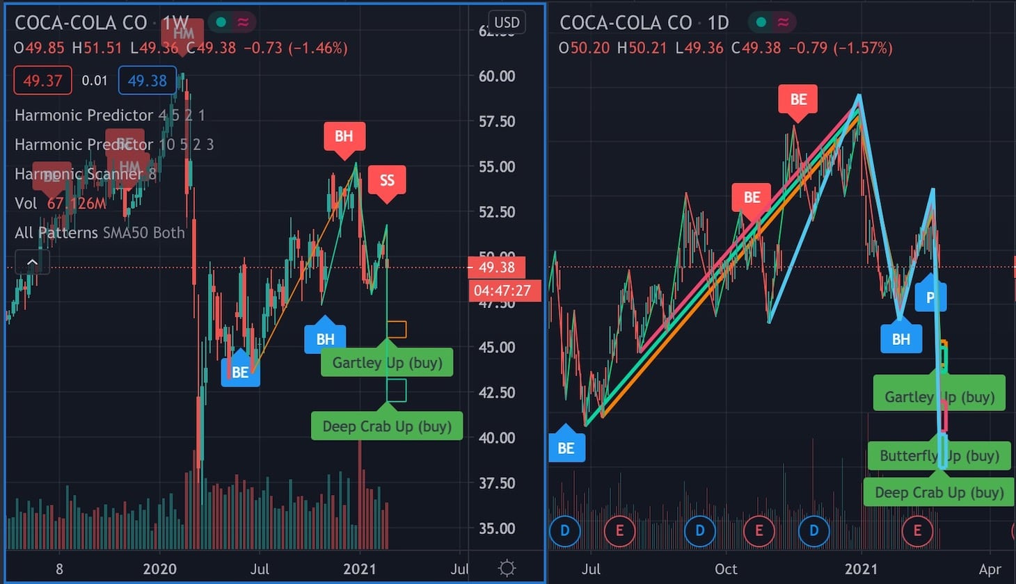
Here is how this chart usually looks like:
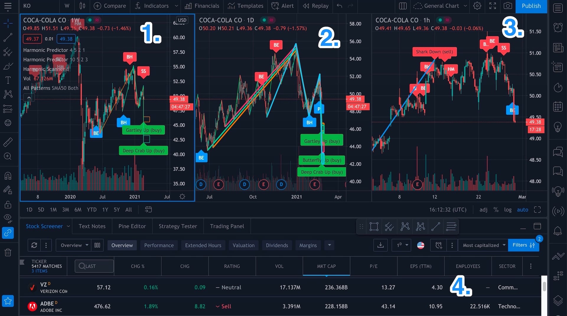
TradingView chart with 3 intervals and 4 indicators that I usually use. Click to zoom.
There is a lot going on here. Normally I use an ultra-wide screen where I can easily see everything, but for the purpose of taking the screenshot, I had to use my Macbook’s screen for better resolution. Here is what we can see on the chart:
- Weekly chart. This one contains two Harmonic Predictor indicators (one for low and the other one for high depth).
- Daily chart. Here is where I look for the patterns and perform the rest of the technical analysis (draw trend lines, channels, etc.)
- Hourly chart. After I decide what trade I want to make, I use the hourly chart to wait for the trend to change and enter the trade.
- Stock scanner. This is the fastest way to go through a list of stocks. In this case I choose the USA stocks sorted by the highest capitalization. Sometimes I also use the “Hotlists” that TradingView offers that lets me choose the volume gainers (higher volume means that more investors are interested in a specific stock) or percent change gainers.
Once I find a stock with some interesting harmonic patterns, I move to the second step of the analysis.
Add other technical analysis tools
Let’s see an example. For obvious reason, I can’t use the latest prices and try to predict the future, because it could be treated as a financial recommendation (and nothing on this website is a financial recommendation). It has to be done for educational purpose.
So let’s use this chart of UNP (Union Pacific Corp).
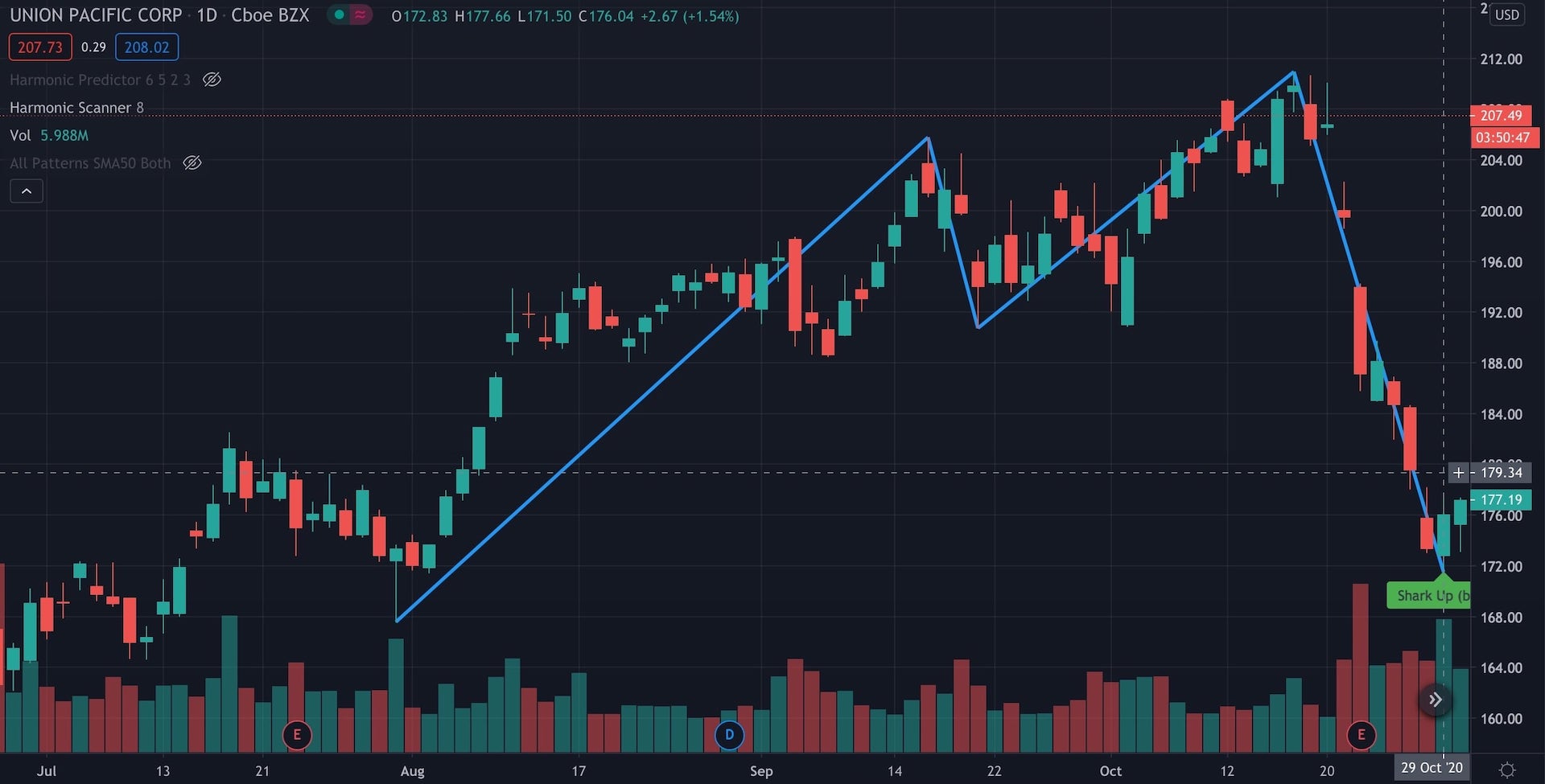
UNP with a Shark pattern
On 29th of October 2020, a Shark pattern has formed up and then the next day the price started going up. That’s a good sign, it means that the price might respect the harmonic pattern and change direction. I could buy the stock already, but I want to confirm that the end of Shark formation ($170-172 price level) is a strong support level. I can do this by checking additional technical analysis tools.
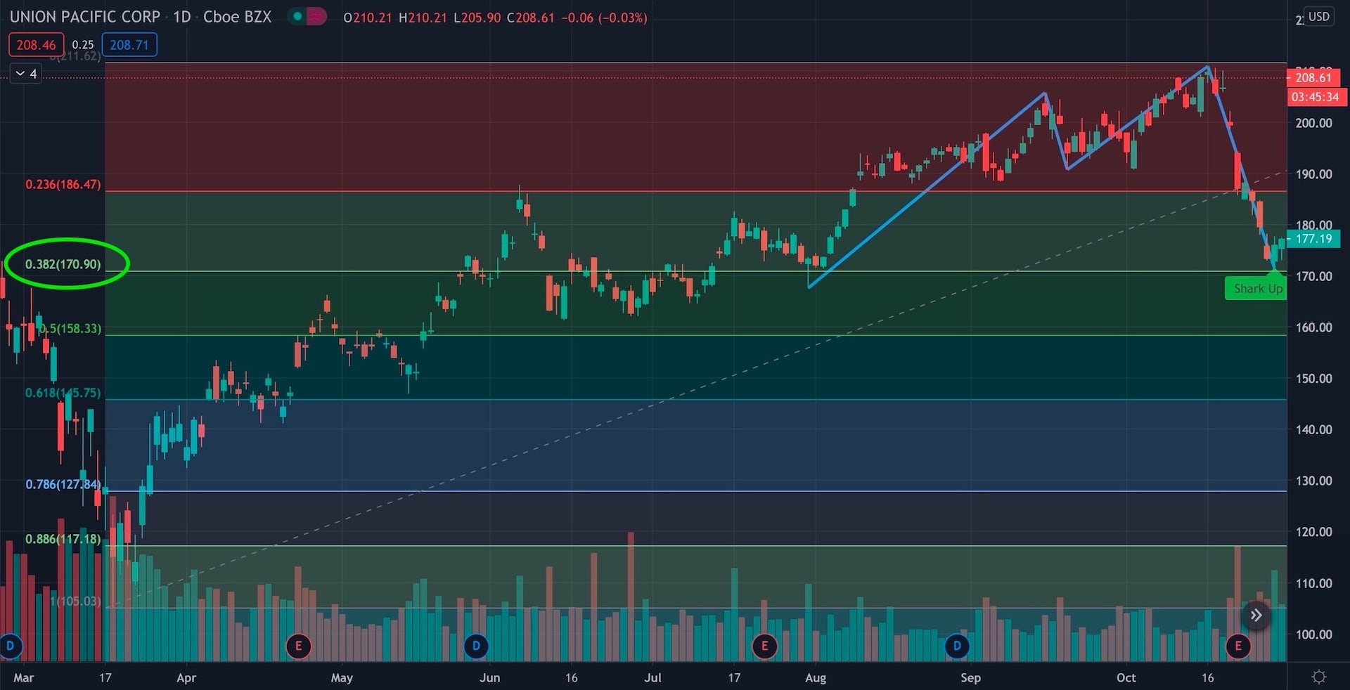
First set of Fibonacci retracement levels
I draw Fibonacci retracement levels from the bottom of the chart (the crash in March 2020) all the way up to $208 where we had a peak. And the end of the Shark formation is located at 0.382 retracement level! That’s very promising!
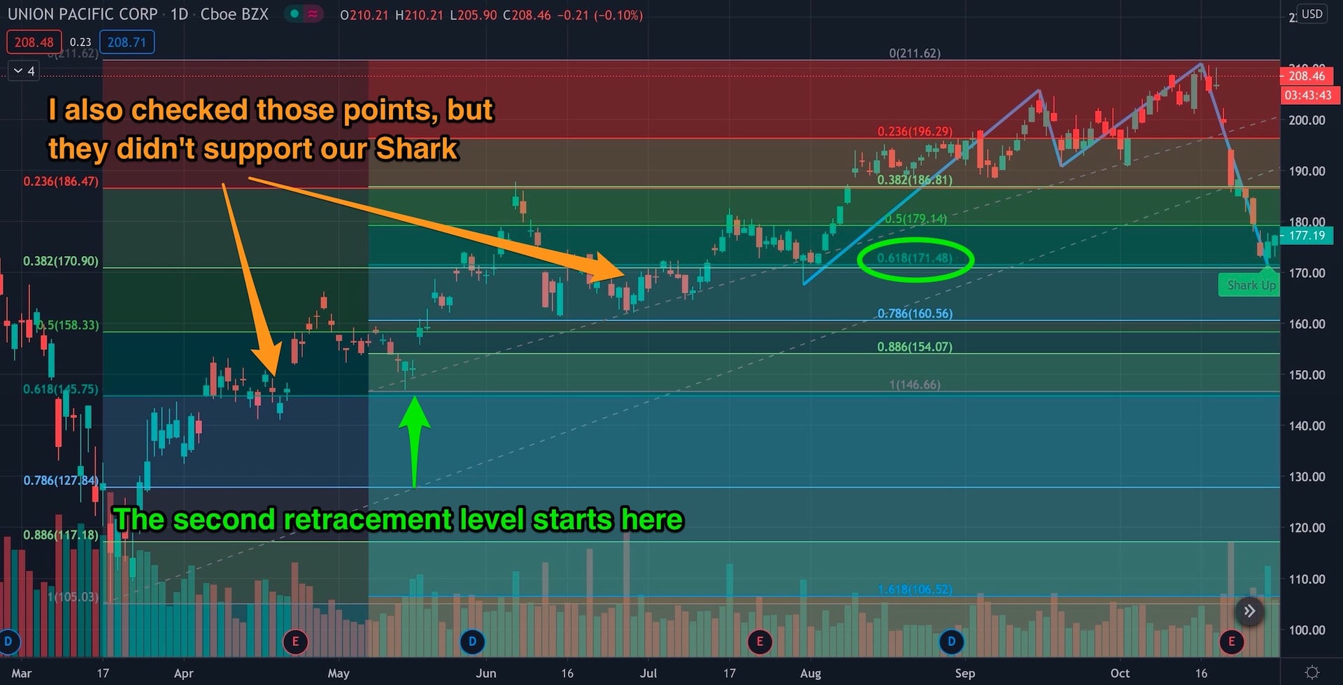
Second set of Fibonacci retracement levels
I check some other Fibonacci retracement levels by drawing them from the local minimum points on the way from $105 (March 2020) to $208 (October 2020). One of them confirms the “Shark level” because there is 0.618 retracement in that area. So we have 2 Fibonacci retracement levels that support this Shark formation.
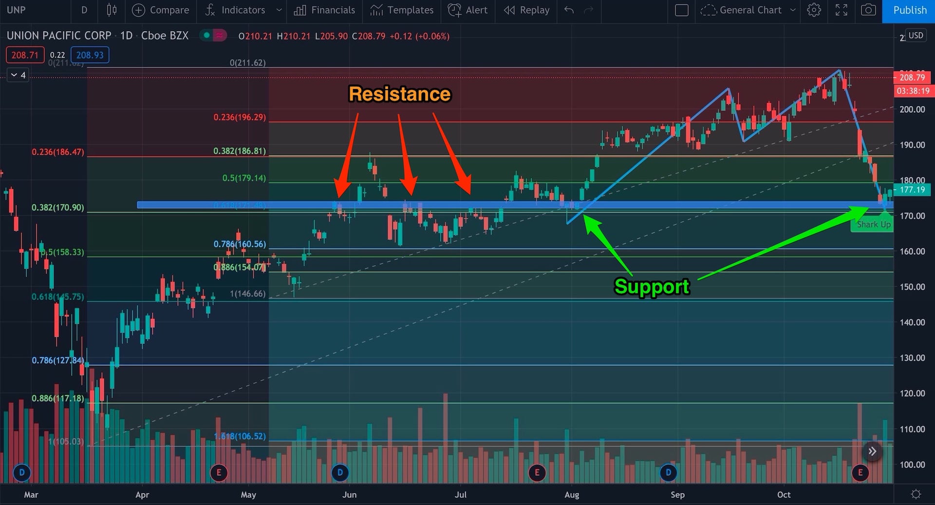
Resistance line that later becomes a support line
After that, I look for support/resistance levels. And again, it turns out that there is a line that was once the resistance and then it turned into support (the blue long rectangle). That’s another strong signal that the Shark formation can be a support level for the price.
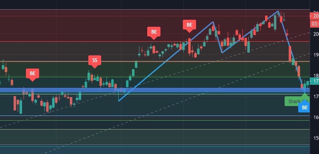
Bearish Engulfing (blue BE symbol) candlestick pattern
If we enable the candlestick indicator, we can see that the candle where the Shark formation has formed is also a candle that shows the Bearish Engulfing pattern. Another evidence to support the thesis that the price will change in that place.
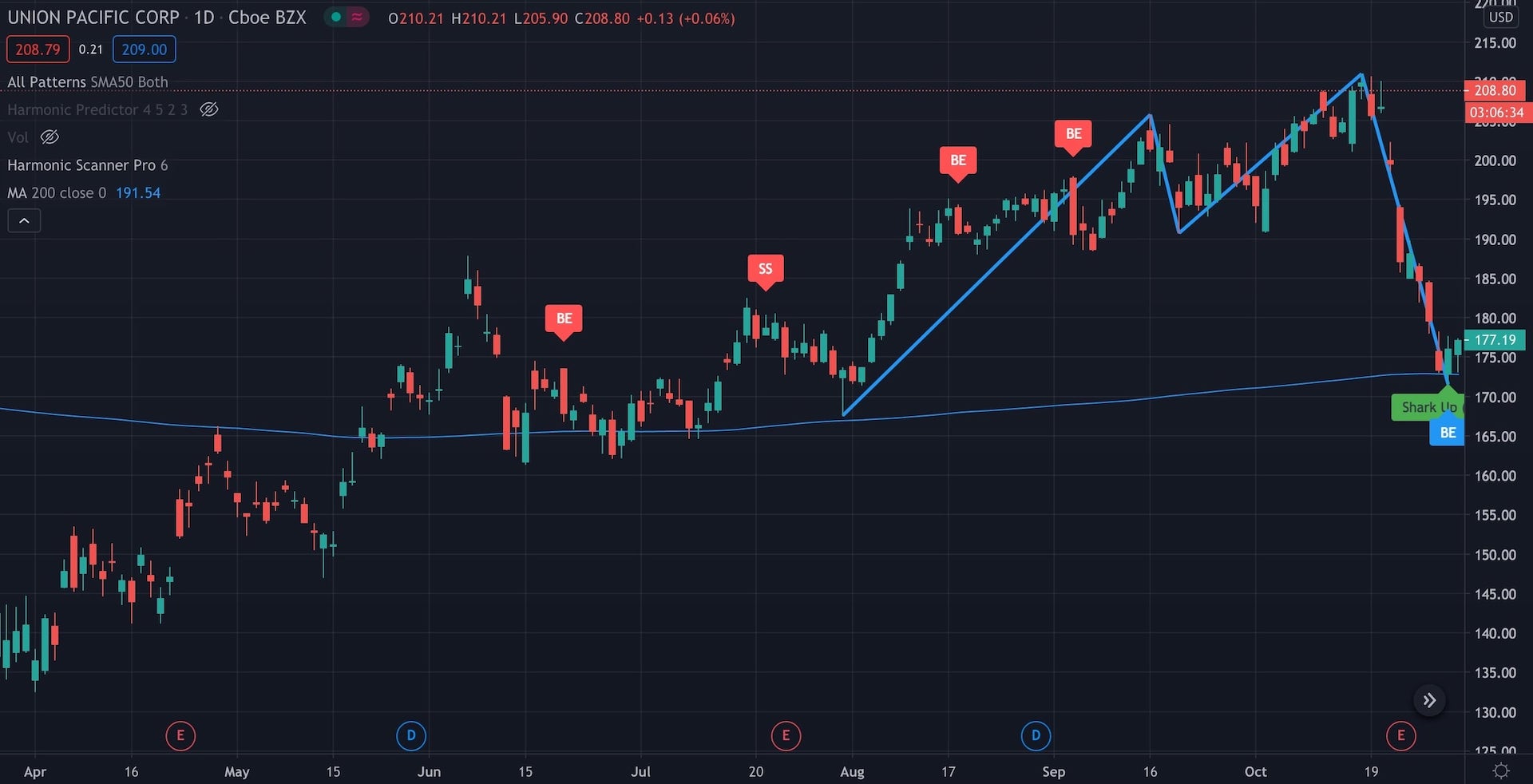
Moving Average from the last 200 days
And to make it even better, if we add the Moving Average (200) - so the really long-term moving average line that is also a strong support/resistance level, we can see that it goes exactly through the bottom of the Shark. And in the past the price has changed direction at or around this line.
So we have a harmonic scanner predicting a Shark formation and we can support it with:
- Two Fibonacci retracement levels (one of them is very strong because it’s based on medium term price changes)
- One support/resistance line
- Moving Average line from the past 200 days
- And a candlestick pattern
With all this additional support, it’s a really strong signal for me and I would definitely buy UNP if I saw all that.
What happened next?
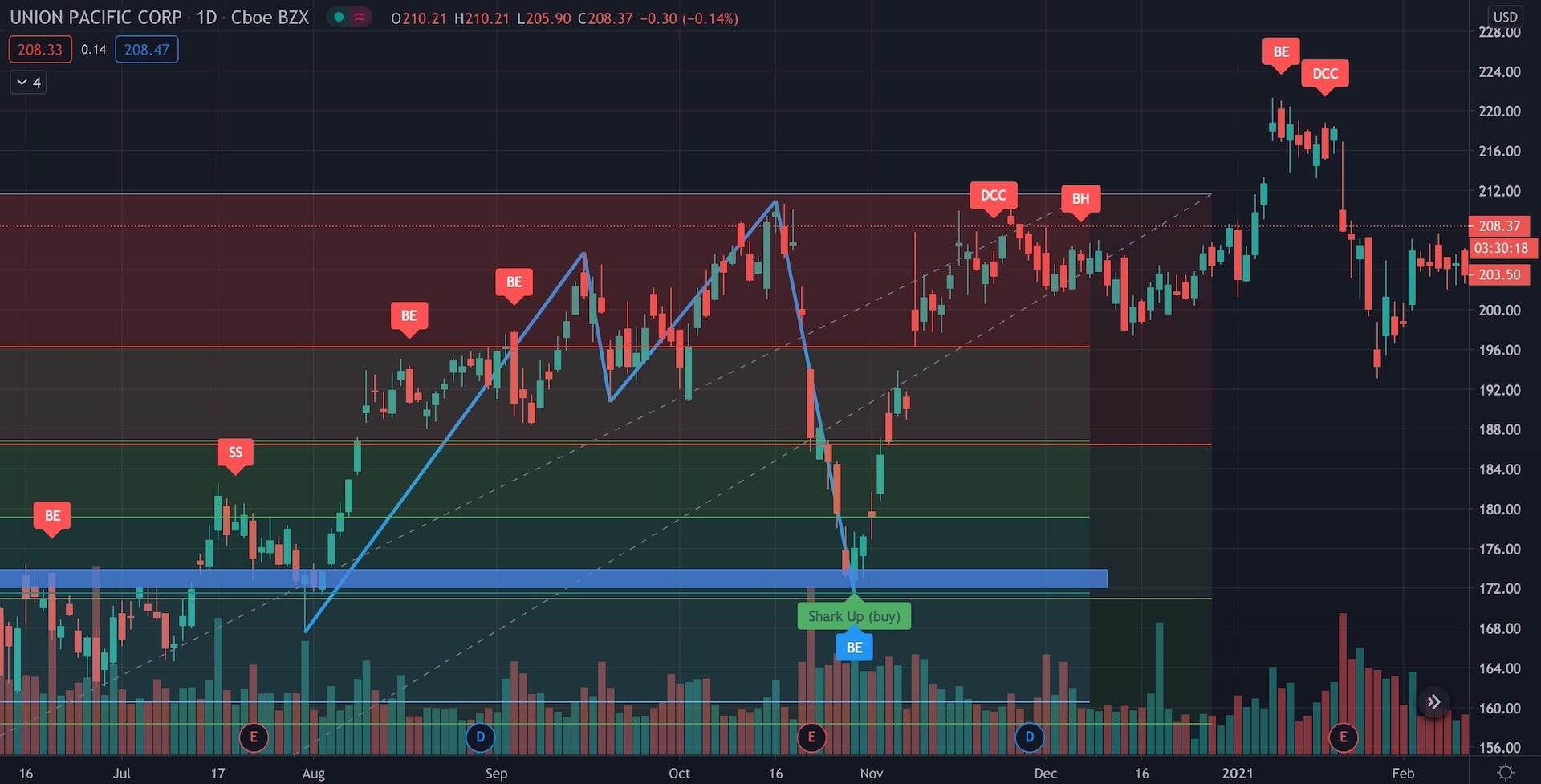
UNP price changed direction after the Shark formation
The price went up all the way to the previous maximum (from $176 on 30th October to $209 on 16th of November) gaining almost 15% in two weeks.
It’s not always that easy!
That looks easy, right? Well, it’s not. I’ve analyzed a bunch of other stocks until a got one where so many other technical analysis techniques supported the harmonic patterns. Plenty of financial books or blogs (especially those that want to sell you some “miracle trading formula”) shows you only the successful charts. But often you will see a harmonic pattern that you won’t be able to support with anything else.
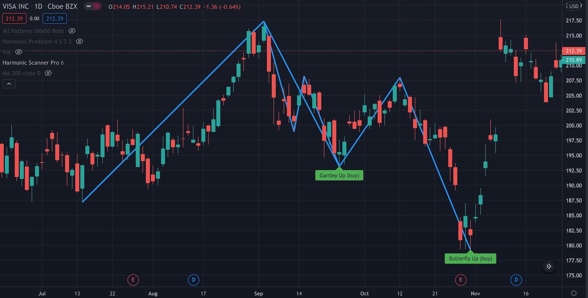
Visa with 2 harmonic patterns in September and October 2020
On the above chart we have Visa with two harmonic patterns.
To detect harmonic formations that far in the past, I used the Harmonic Scanner Pro.
Let’s draw them with proper drawing tools and put arrows showing when I should buy/sell.
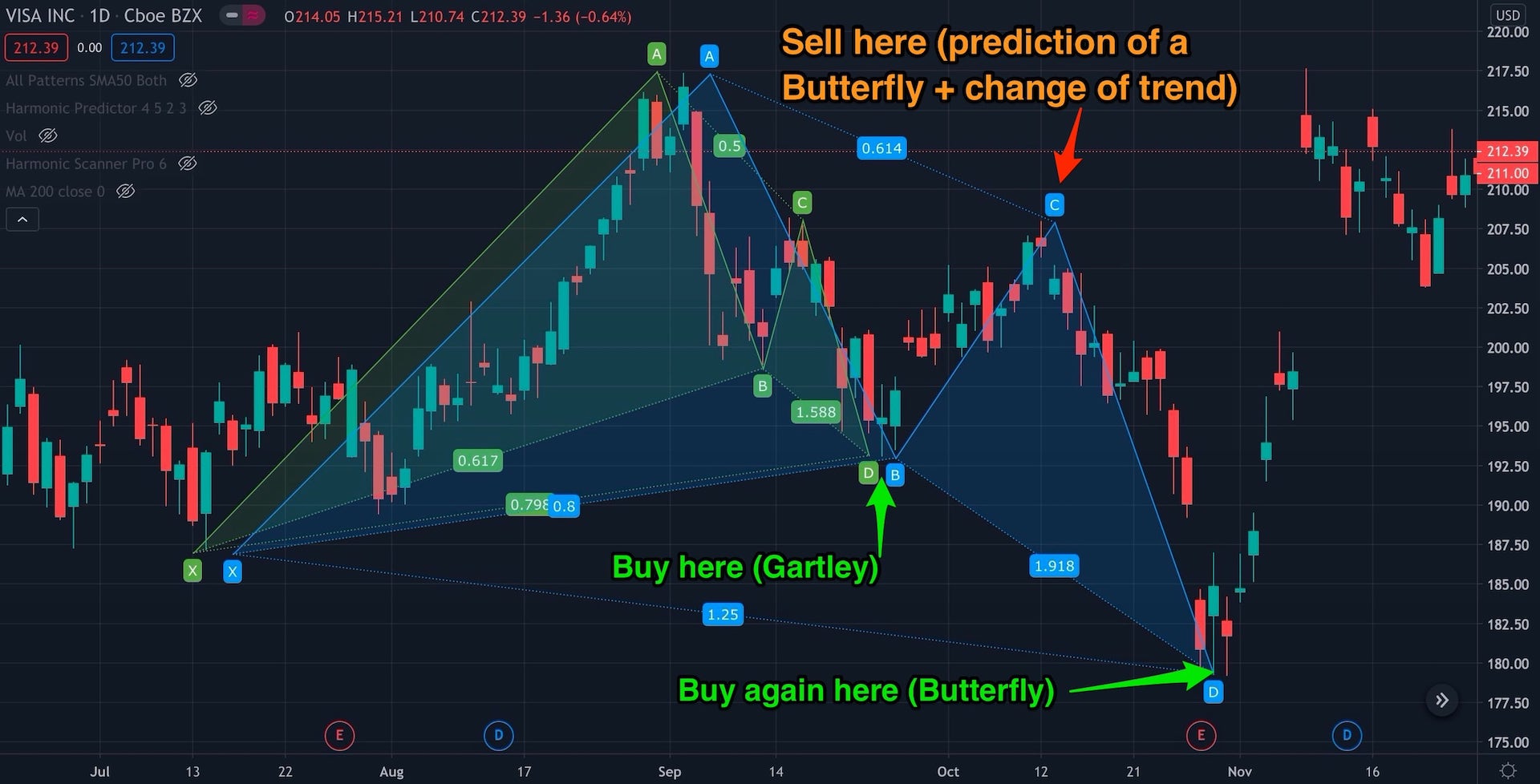
Visa with 2 buy and 1 sell signals
In September 2020 we got a Gartley pattern suggesting that we should buy this stock. Then on 13th of October we could use the Harmonic Predictor to see that there is a possibility for the Butterfly forming at around $180. If we sold our stock now (or even better - turned it into a short position) and then bought it again at $180, we could enjoy the sweet ride all the way from ~$180 to $217 levels (or more likely, we would probably sell at around $210 after the change of the short-term direction). And that’s on top of the profits that we got from the previous Gartley formation (from ~$193 to ~$205)!
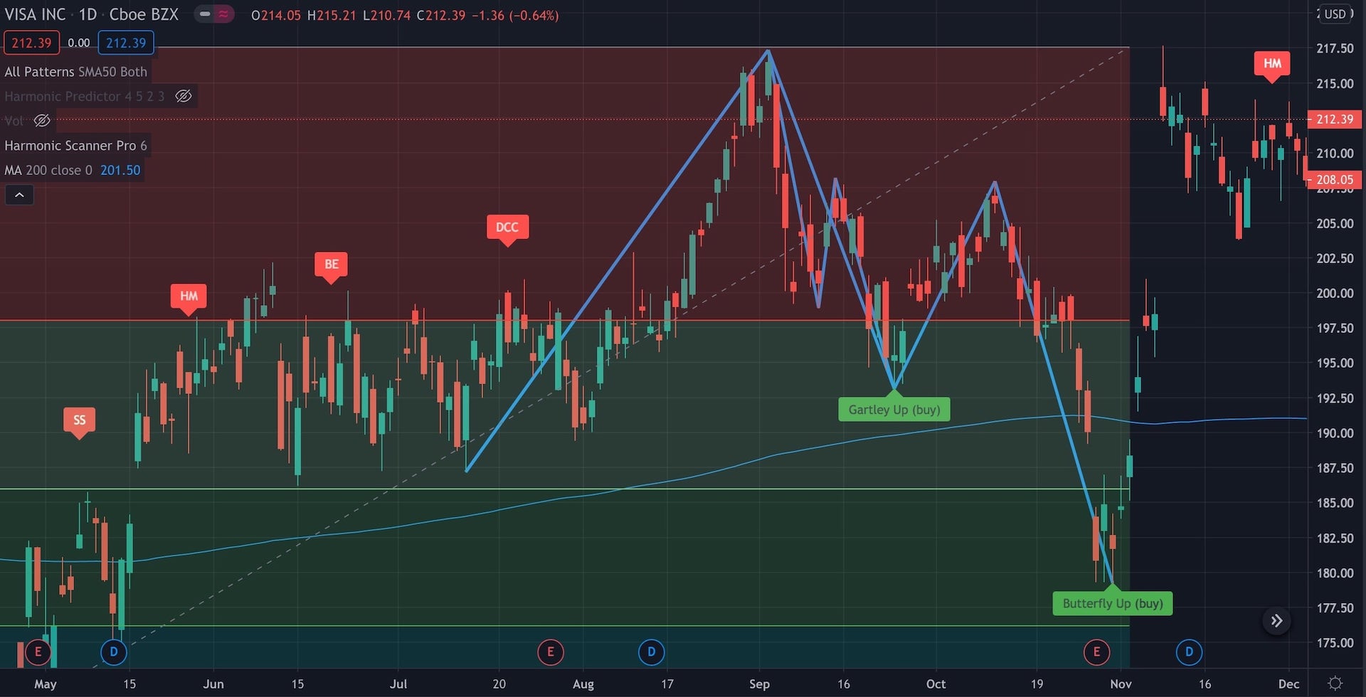
Let's add Fibonacci retracement levels, candlestick indicators, and the MA (200)
But, nothing really supported this theory! No other tool that I’ve used before would confirm that this is what’s actually going to happen with the price. Drawing Fibonacci retracement levels from the the bottom in March 2020 doesn’t create any clusters. The 200-days Moving Average line just goes in the middle between Gartley/Butterfly and the price ignores it. And no candlestick patterns have formed at any of the buy/sell points.
If you use different tools, maybe some of them would support this theory. But that means you have to use even more techniques to analyze each stock, and if that’s not your daily job, you probably won’t have time. I prefer to stick with just a few techniques, but check more stocks. Even if it means that I will miss some trades.
Is technical analysis even worth it?
Don’t get discouraged. Finding good opportunities is difficult. There is no one magic tool that will work most of the time - if there was, most traders would be using it and after some time this tool would turn useless (if everyone starts trading according to the same pattern, then this pattern stops working).
For me, starting with harmonic patterns works well, because it lets me quickly see stocks where something interesting is happening. Sure, I might be missing on a lot of other stocks, but that’s fine. I have limited time for my technical analysis and any tool that can help me quickly discard most of the stocks is helpful.
If there was one thing that I want you to remember from this article, it’s that using just the harmonic patterns is usually not enough (unless you are lucky, but then you are gambling, not trading). But they are a good first step to perform a thorough technical analysis!
The information contained in this article is for educational and informational purposes only. Any information provided on this website does not constitute investment advice or an investment recommendation. Seek a duly licensed professional for investment advice.
Charts used in this article were created using the TradingView platform