After I learned how to use harmonic patterns, I asked myself: “Can we predict them?” Harmonic patterns are based on 5 points: X, A, B, C, D. So how about we try to draw the first 4 points and estimate where the point D should be located? In theory, it should be possible. I mean, obviously, before each formation showed up on the chart, there was a time in the history where it had only 4 points, and the price was moving from point C to D.
Predicting harmonic patterns
That’s why, here at Patterns Hunters, we decided to give it a try, and we created the Harmonic Predictor script. It works exactly as described above. It checks a bunch of high/low points on the chart and tries to fit them into the mathematical definitions of each harmonic pattern. For example, when checking for the Gartley pattern, it checks:
- Is there a point B located at around 61% retracement of the XA line?
- Is there a point C located between 31% and 88% of the AB line?
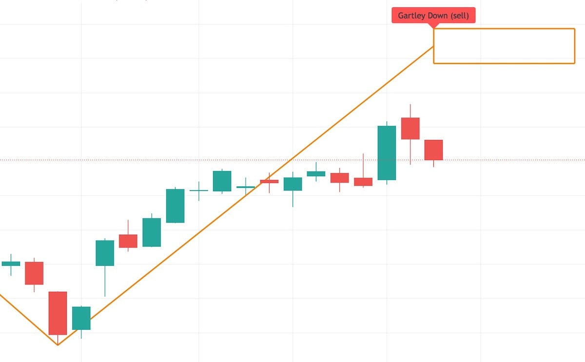
If there are, that’s promising! So we draw a “possible point D” located at 78% retracement level of the XA line:
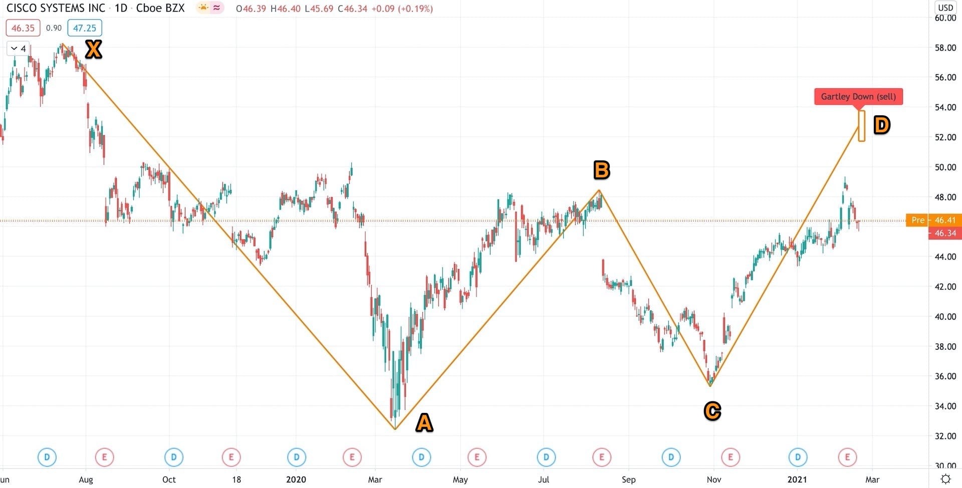
Possible Gartley formation for CISCO. You can click on any of the charts to zoom in.
Not sure what are those “retracement levels” or “Gartley pattern” means?
Check out my introductory “What Are Harmonic Patterns?” article.
Of course, a few things have to be checked on the way. For example, did we already reach point D? If yes, then it’s no longer a prediction but an actual formation that the Harmonic Scanner should discover. Or maybe point C was negated? If the price changed direction and moved past point C, then our prediction was negated.
But as long as none of that happens, we can draw a prediction on the chart.
Using the Harmonic Predictor
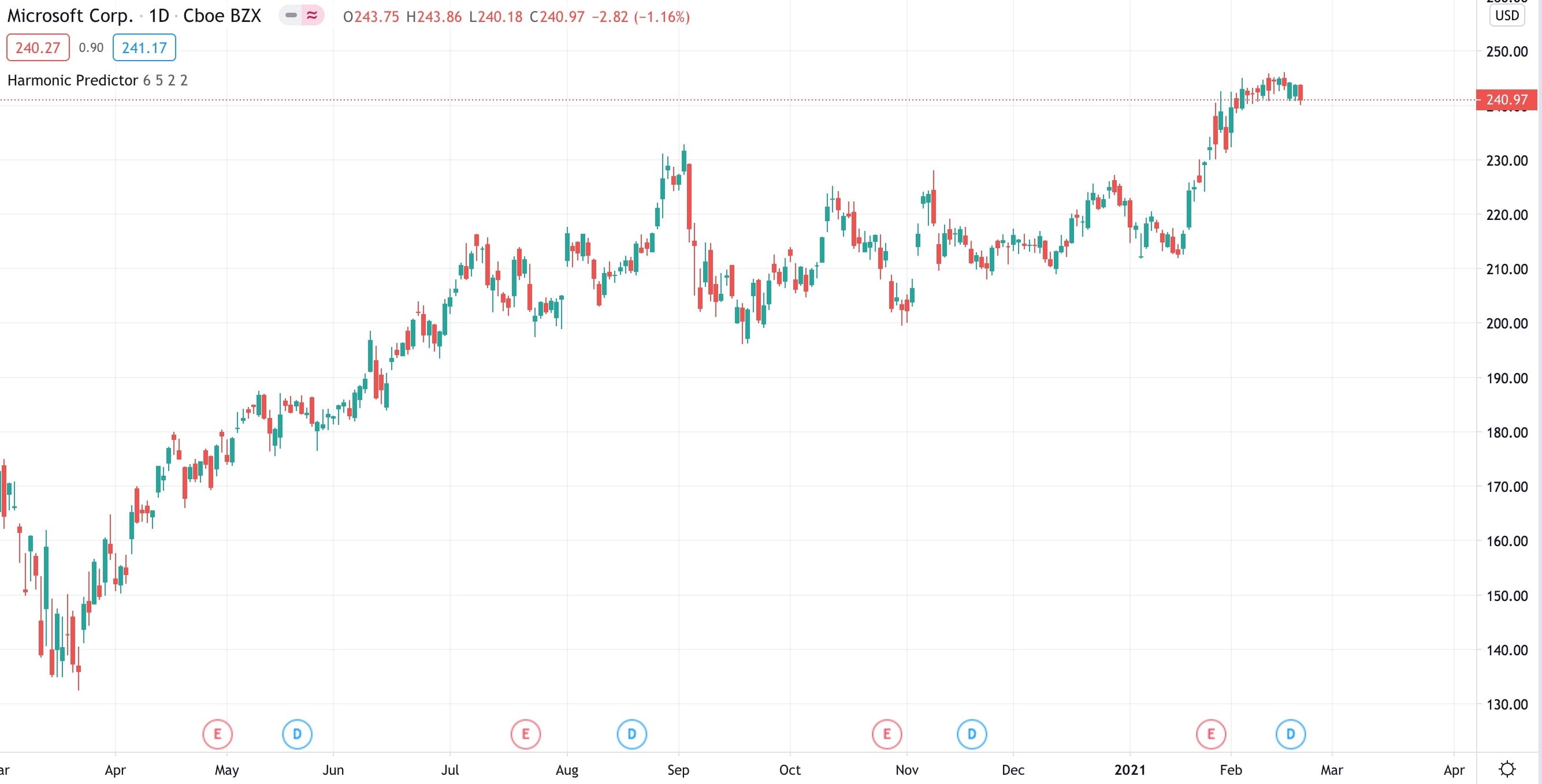
Once you add the “Harmonic Predictor” indicator to the chart, you will see the possible harmonic patterns. If there are any. Harmonic patterns are rare, especially since this script has only a 5% error tolerance. So we are looking for “almost perfect” textbook patterns.
If the script can’t predict any pattern, then it won’t draw anything.
Where are all the patterns?!
If you want to see what points were checked, open the configuration options (click the cog icon) and enable the “Draw ZigZag?” option. This will add the zigzag line to the chart, which connects the high/low price points.
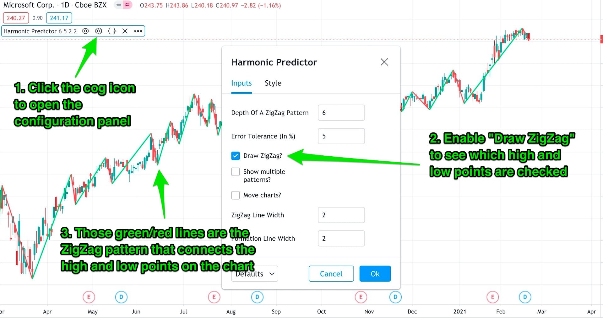
Enable the ZigZag pattern to see which high/low points are checked.
You can change the zigzag’s depth by adjusting the “Depth Of A ZigZag Pattern” option. If you choose a high number, fewer points will be selected. But the selected points are the important ones. You will eliminate many local high/low points and focus on the global ones. However, short periods of extreme volatility (when the price goes up and down like crazy within a short period) will also be ignored.
When you use a high depth value, you will find fewer harmonic patterns. But when you find one, it will be much stronger than a harmonic pattern based on some local high/low points situated in the middle of the price trend.
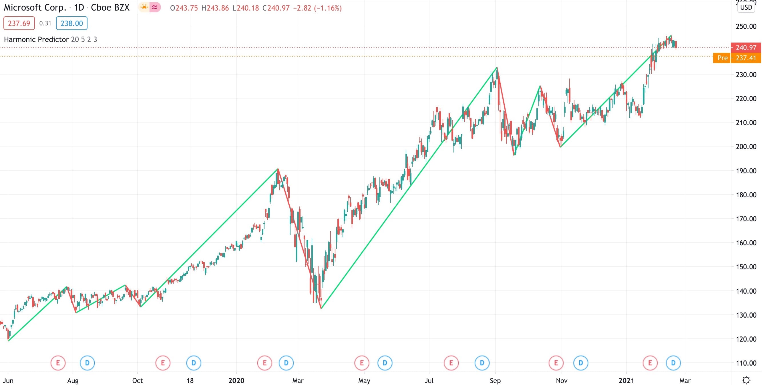
Setting a very high depth forces the indicator to only check the most important high/low points
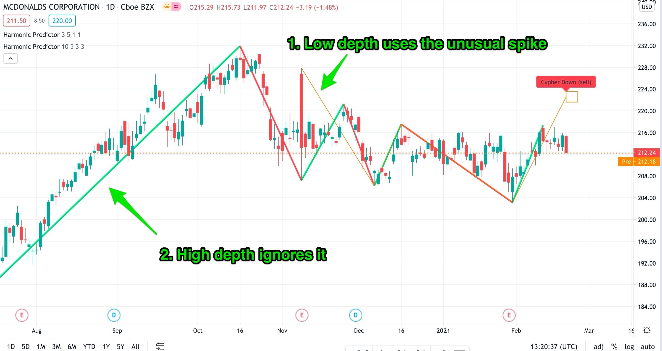
On the other hand, when you select a smaller depth, you will check more points. And you will find more harmonic patterns, but quite often, they won’t be reliable. If we use some random local high/low points, I doubt that the price will respect them. On the chart below, we are using depth=4, and we found a harmonic pattern prediction, but it starts in the middle on the upward trend, and no one is going to take it seriously.
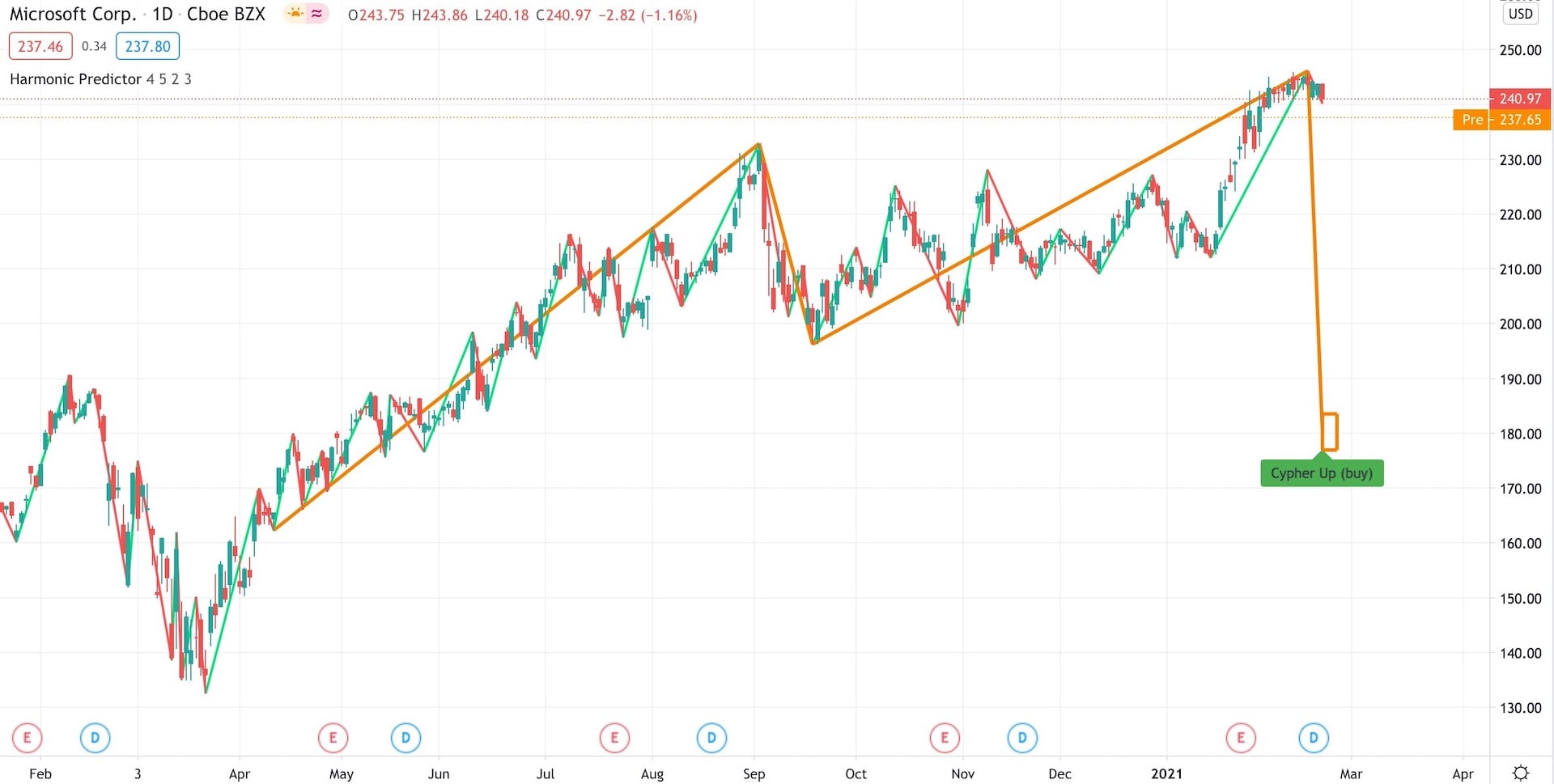
We decreased the zigzag depth from 6 to 4 and found a Cypher pattern. But it starts in the middle of a strong upward movement, so I wouldn't trust it too much.
You can play with the depth parameter to see what settings work for you. The default value of 6 is a good default to start with.
You can also add multiple Harmonic Pattern indicators to the chart and set a different depth for each of them. In this situation, I like to use a different line width for each of them:
- Width 1 for the “low-depth” indicator, so I know that its predictions are not very strong.
- Width 3 for a “high-depth” indicator (depth equal to 6, 8, or even 10) to indicate that those are stronger predictions.
Low depth vs. high depth
In the above example, we detect a Cypher formation when we use a low zigzag depth - it starts from the unusual spike in November. But when we use a higher depth (see the thick zigzag line), that spike is ignored.
Not all predictions are good
You see, using predictions of harmonic patterns have a much lower success rate than trading based on the actual patterns. It’s less likely that the price will go from point C to D and form the harmonic pattern. So it’s even more important to support the possible harmonic pattern with additional technical analysis tools.
I don’t make trades just because the Harmonic Predictor shows a possible pattern. Some of the predictions can be outright ridiculous. A 50% crash of a stock that has been going up for three years? I wouldn’t put any money on that scenario unless I can support it with multiple pieces of evidence!
Two things that we can do to improve the efficiency of our trades based on the predictions are:
- Avoid trading against the current trend
- Use a good stop loss
Let’s expand those ideas.
Don’t trade against the trend
Trading against the current trend is generally a bad idea. No matter if you use harmonic patterns or any other technique, the chances of predicting when the direction will change are extremely slim. Unless you are a professional analyst and you have been analyzing stocks for years. In this case, they are just slim.
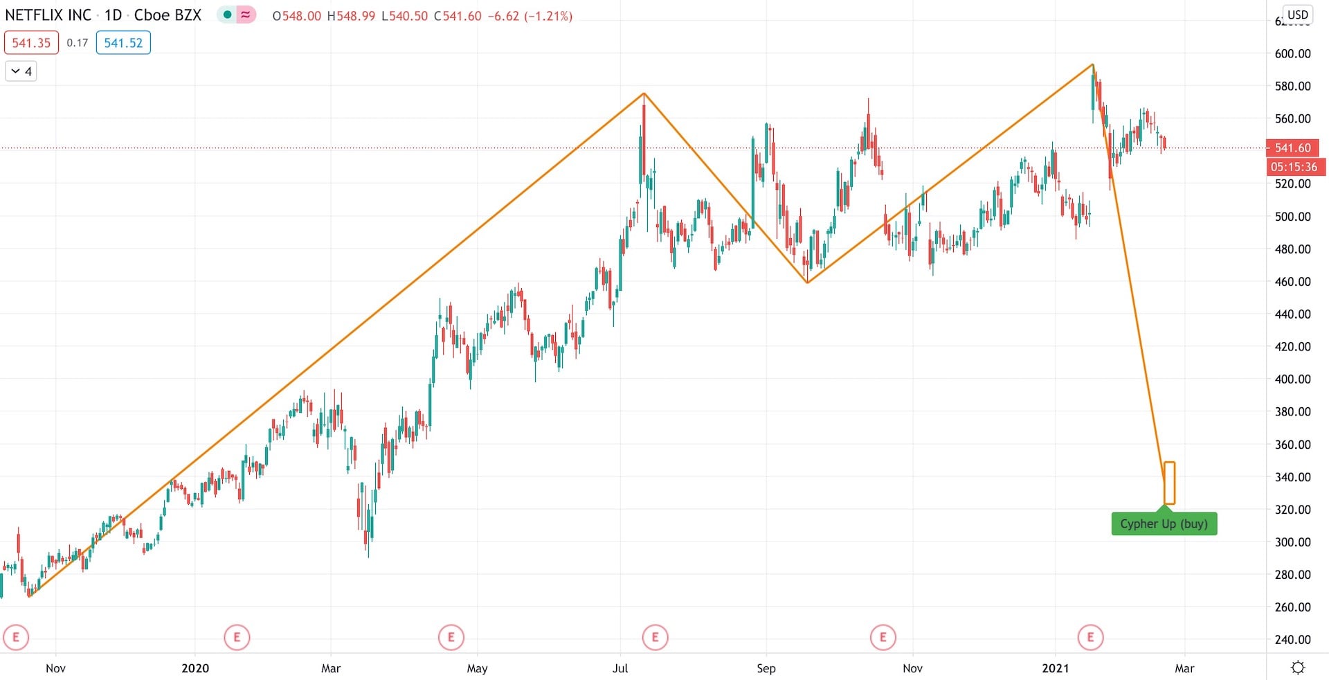
A (quite unlikely) prediction of a Cypher pattern on Netflix
In the above example, we have a prediction that Netflix will go down by 40% (from $540 to around $330). Sure, that’s possible, but probably only if we had a massive crash. Opening a short position now is like opening a short position in Tesla - people have been doing it for years, and Tesla is still going up, reaching P/E (Price/Earnings) ratios of over 1000.
Let’s be more rational.
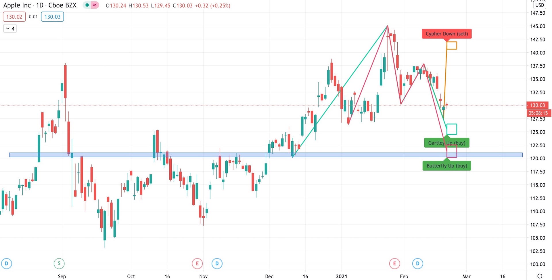
A (better) prediction of multiple patterns on Apple
In the second example, we have Apple and a prediction for a correction that may reach the Gartley pattern around $125 and Butterfly around $120. Apple’s long-term trend is bullish (as for most of the US stocks), but at the end of January, a correction has started.
This prediction is much more likely. In the “Butterfly zone,” we have a support/resistance area (blue rectangle). If we continue our analysis and confirm that indeed more tools are pointing to one of those areas (the Gartley or Butterfly zones), it gives us two useful information:
- The price will continue going down to one of those two levels
- Then it may change direction, so it’s time to reverse our trade (close the short position and open a long one)
But I might be completely wrong, and tomorrow the price can turn and reach the bullish Cypher at the top of the chart.
Use a good stop loss
This one is tricky. If we open a stop loss when the price is still close to point C, we have a much higher chance that the price will ignore point C and not go towards the predicted point D. Our loss is small but unnecessary. If we wait to see if the price respects point C, we can avoid it.
On the other hand, let’s say that the price indeed changed direction in point C and it’s halfway to point D. If we put a stop loss around point C, and the price changes direction again (without reaching point D), our stop loss will trigger and we lose more money.
There is no right way to deal with this problem. Depending on the risk we are willing to take, we will open our positions in different places. Sometimes the price might bounce back to point C (clearing our stop loss) and then go to point D (as we initially assumed).
I like to use a tight stop loss to minimize my losses. In this case, it makes sense to enter the trade close to point C. Yes, it means that very often, the price will trigger my stop loss and change direction. In this case, I enter again. It can be extremely frustrating to open the same position a few times in a row and see that I’m losing a bit of money each time. And it requires a strong will to not give up. But what’s more frustrating is seeing that I was right about the price direction and missing that trade.
I was not using stop-loss orders in the past, and I ended up with too many stocks that became a “long-term investment.” Except that those were not good stocks to keep long-term. I eventually closed most of them with a loss. The only trades where I don’t use stop-losses are ETFs or real long-term investments. As long as I assume that those are long-term positions before I buy them, I don’t care if the price drops by 50%. If I still believe that they will be worth more in the future, I keep them. But that’s just something I do, and like everything on this website, it’s not financial advice.
Alternatively, if you want to wait and check if the price moves further from point C towards point D, you could put an alert at a specific price level. When you get a notification, you will know that point C was indeed a place where the price changed direction.
To predict or to not predict?
Trying to predict harmonic patterns is a good tool that can be included among other technical analysis tools. If we have a clear trend, and a prediction that we can support with other tools (trend lines, support/resistance lines), it’s much more likely that this pattern will eventually show up. On the other hand, some patterns will show up only if the price suddenly change direction and crash (or raise) by 50%. Which can happen, but it’s better to ignore them.
If we are lucky, after reaching point D and forming one pattern, there will be another prediction for a different pattern in the opposite direction. It doesn’t happen very often, but when it does, it’s a great feeling to see how trades successfully close at predicted levels.
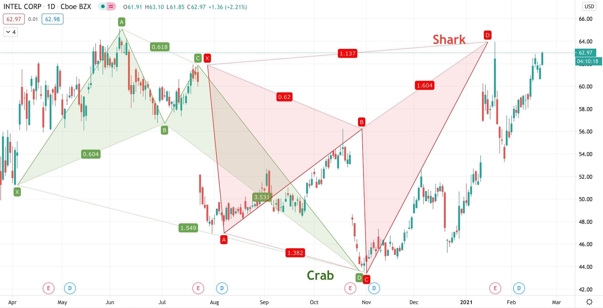
After forming the Crab pattern, Intel's price went all the way up to form the Shark pattern.
The information contained in this article is for educational and informational purposes only. Any information provided on this website does not constitute investment advice or an investment recommendation. Seek a duly licensed professional for investment advice.
Charts used in this article were created using the TradingView platform