As you probably noticed, many topics on this website revolve around the “harmonic patterns,” like the one on the picture above. So what are those harmonic patterns? When I first saw them, I was confused - how is this weird “double triangle” supposed to tell me anything about the chart? What do those letters and numbers even mean?
It’s easy to understand how a price channel works when you first see it - there are two lines, and the price stays between them. When it goes above or below a line, it means that the trend may change. Or the support and resistance lines - if the price is bouncing off some line and suddenly crosses it, it’s probably a good time to buy or sell. You probably don’t even need to read an explanation of a price channel or support line to intuitively understand how it works. But that was not the case with harmonic patterns, at least not the first time I saw them. Luckily, once you know the theory behind them, they are no more complicated than other technical analysis’ tools.
Albert Einstein once said: “If you can’t explain it simply, you don’t understand it well enough.” So let’s see if I really understand the harmonic patterns by explaining how they work. I will try to use simple terms and not get too deep into the details. Just enough so that you understand how they work and how to use them when trading. At the end of this article, I will link to some other resources covering this topic in more detail.
Fibonacci numbers and technical analysis
Before we can talk about harmonic patterns, we need to talk about Fibonacci retracement and extension levels. As you maybe remember from school, Fibonacci was an Italian mathematician who documented a sequence of numbers called Fibonacci numbers: 0, 1, 1, 2, 3, 5, 8, 13, 21, and so on. The next number is created by adding together two previous ones. Fibonacci numbers are based on the Golden Ratio, and the golden ratio number is equal to around 1.618 (keep that number in mind, we will need it in a moment). It turns out that many things in the world are somehow based on the golden ratio: plants, buildings (the pyramids), books published in the XVI and XVII centuries, and so on.
If we take the Fibonacci sequence and divide each two consecutive numbers, we get the following results:
- 1/1 = 1
- 1/2 = 0.5
- 2/3 = 0.66
- 3/5 = 0.6
- 5/8 = 0.625
- 8/13 = 0.615
And so on. After the first two results (1 and 0.5), the following numbers will end up around 0.618.
If we divide them the other way around:
- 5/3 = 1.66
- 8/5 = 1.6
- 13/8 = 1.625
- 21/13 = 1.615
The results will end up around 1.618. Hey, that’s the golden ratio number that we saw before! At the same time, 1.618 is a reciprocal of 0.618 (1 / 1.618 = 0.618). Sorry for all that math, we are almost done!
If, instead of dividing the consecutive numbers, we divide numbers that are two positions away in the Fibonacci sequence:
- 1/3 = 0.33
- 2/5 = 0.4
- 5/13 = 0.38
- 8/21 = 0.381
And the other way around:
- 3/1 = 3
- 5/2 = 2.5
- 13/5 = 2.6
- 21/8 = 2.625
we get 0.382 and 2.615.
So we got numbers 0.382, 0.5, 0.618, 1, 1.618, and 2.615. What do they have to do with stocks? Well, it turns out that more often than not, if the price goes up (or down) and then we have a correction, this correction will stop after falling down by 38%, 50%, or 61.8% of the previous move. See the charts below.
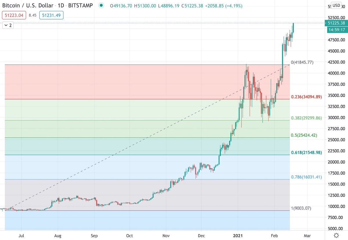
BTC/USD
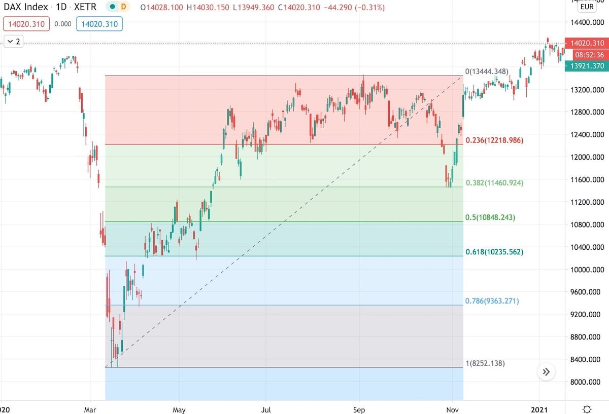
DAX Index
Here, the DAX index and Bitcoin were going up and then had a correction that stopped precisely at or very close to the 0.382 level. 0.382 level (or ratio) means 38.2% from the maximum. We call those levels retracement levels if they are lower than 1 (because price moves in one direction and then it retracts by 38% or 50% or 61%).
On the other hand, if we have a correction and then the price starts going up reaching one of those levels above 1 (so 1.618, 2.615), we call them extension levels:
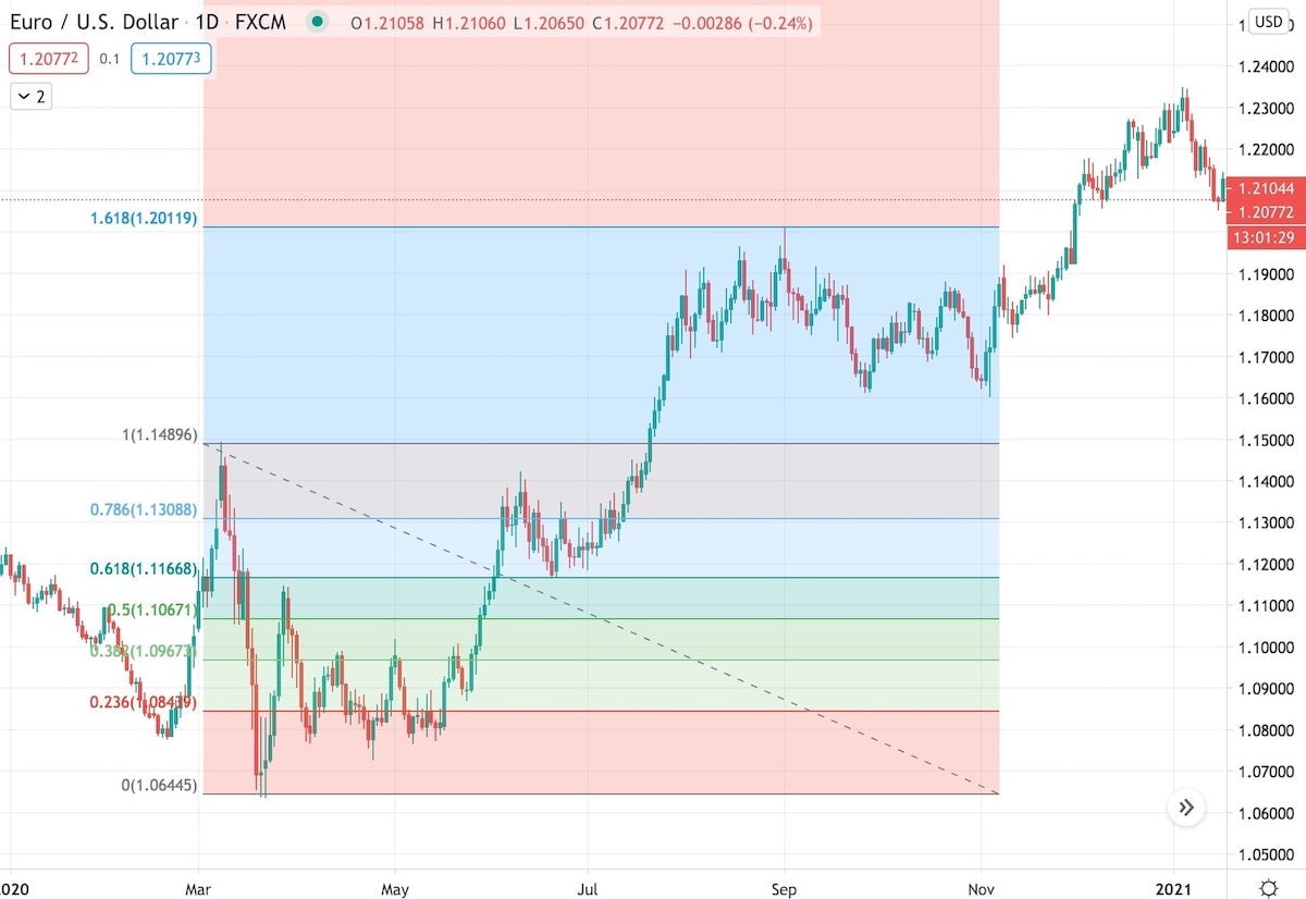
EUR/USD
Here the EUR/USD went up by 161% (so it reached the 1.618) before a new correction started.
All the above examples show bullish scenarios, but the retracement/extension levels work the same if the price goes in the opposite direction. The only thing that matters is at what level the price changes direction.
The retracement and extension levels can be a strong support or resistance. If the price doesn’t respect them, so for example, if the correction doesn’t stop after reaching 38% retracement, we can expect that it will continue its current trend to the next level (it might stop at 50% or 61.8%). But often, those levels are respected.
Apart from the numbers that I mentioned, there are other levels introduced by different technical analysts. For example, Jim Kane introduced 0.886 and 1.128 ratios. Some other popular ratios include 0.186, 0.236, 0.685, 0.786 and so on. Those are all retracement levels where we can expect to have some support or resistance lines. One way of using them is to draw multiple Fibonacci retracement levels on the chart and look for places where a few retracements are grouped together (that’s called Fibonacci clusters), but that’s a story for a whole new article explaining the internal/external retracements, so let’s not complicate it.
H.M. Gartley and the first harmonic pattern
All right, so we know that if the price goes up (or down) and then we have a correction, this correction can stop at the Fibonacci retracement levels. However, H.M. Gartley realized something else - if the price moves between specific retracement/extension levels, there is a tendency that after making four specific moves, it will change direction again. See the chart below:
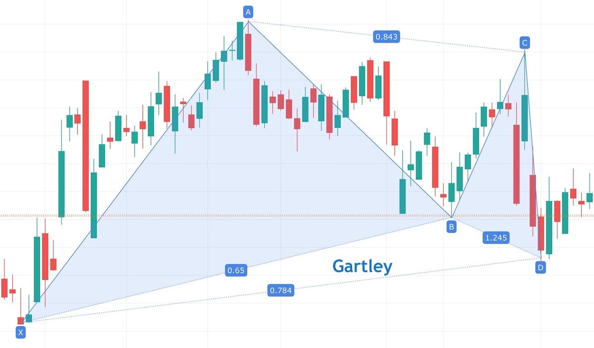
The price moved from point X to A, then moved back to point B, up to point C and again back to point D. H.M. Gartley wrote in his book called “Profits in the Stock Market” that in this situation, there is a high chance that the price will go up again. And it did! What we see on this chart is the first harmonic pattern called the “Gartley pattern” (named after H.M. Gartley).
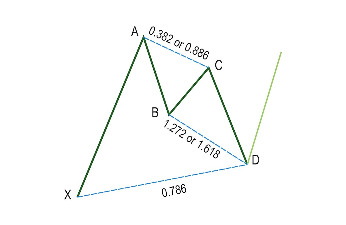
Original Gartley pattern (bullish)
H.M. Gartley wrote that if the price:
- Goes up (wave XA)
- Then it goes down (wave AB)
- Then it goes up (wave BC) by 38.2%, or 88.6% of the wave AB
- Then it goes down (wave CD) by 127.2% or 161.8% of the wave BC. At the same time, wave CD has to be equal to 78.6% of the initial wave XA.
Then we have a harmonic formation called the “Gartley pattern,” and the price should change direction again. In this case, the price is supposed to start going up, so we call this pattern “Bullish Gartley.” But each pattern has two versions - the bullish one and the bearish one. A bearish version of a pattern is a mirror reflection of the bullish one, and it uses the same ratios between each wave, but it predicts that the price will go down.
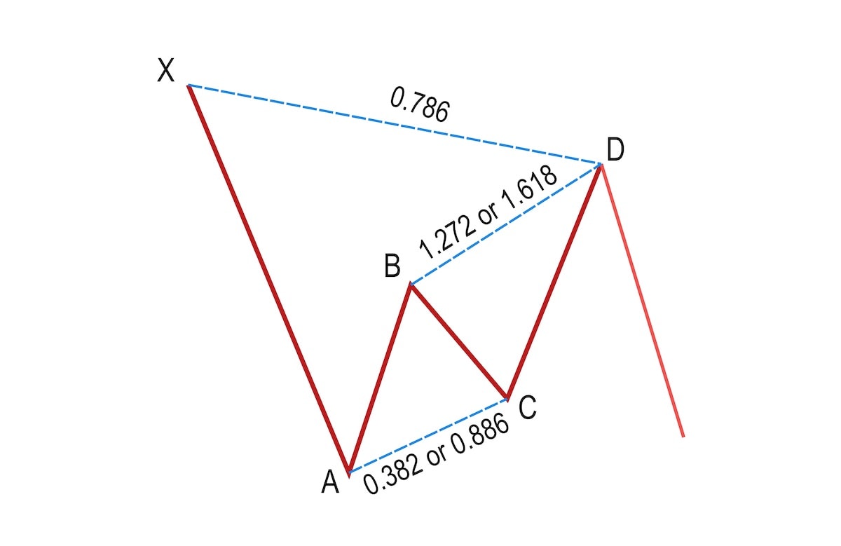
Bearish Gartley pattern
Other harmonic patterns
The Gartley pattern was the first harmonic pattern discovered and described. But later on, Scott M. Carney took the idea from H.M. Gartley’s book and extended it with a few more patterns (he also modified the original ratio for the Gartley pattern). And thus, the Bat, Butterfly, Crab, and more patterns were created.
The only difference between different harmonic patterns are the ratios that we use. But they are all based on the same simple idea that after four waves where each of them stops at a specific retracement or extension level, the next wave will change direction.
How efficient are harmonic patterns?
According to various sources (1, 2, 3), the success rate of harmonic patterns varies between 60-90% (with 80% being the most common number). This means that 4 out of 5 times, the price will change the direction in point D. I don’t trust these statistics too much. First of all, because harmonic patterns should be supported with other technical analysis methods (I will explain this in the next section). But also because many harmonic patterns won’t be “ideal.” Maybe we have a Gartley formation where point D doesn’t land precisely at 0.786 but at 0.77. There are more traders out there (and even more bots that use preprogrammed algorithms). If you see that we have a harmonic pattern, then so do they. Some of them might start buying earlier to not miss the turning point, and if enough people do that, the price might change direction earlier.
Nevertheless, harmonic patterns can be a great tool when performing technical analysis.
Trading harmonic patterns
At this point, you’re probably thinking: “Ok, enough with this theory, how do I use harmonic patterns for trading?”. You could simply put the buy order at point D, add a stop loss below, and that’s it. But don’t be surprised if that won’t work very well.
If there was one thing that I want you to remember from this article, it is that harmonic patterns should not be used as a sole indicator of when to buy/sell stocks! Identifying a harmonic pattern should be the first step of performing a thorough technical analysis. If other tools also prove that point D is a reasonable turning point, then it’s worth considering. You can check for the Fibonacci clusters, draw the Andrew’s pitchfork using previous high and low points, check where the moving average lines go or what the oscillators say. The more different techniques support point D, the bigger the chance that the price will turn direction.
Yes, that’s a lot of work. If a thorough technical analysis were easy, we all would be rich. And yes, even if all the signs support point D, the price might completely ignore it. That’s why you should always use a stop loss.
So spotting a harmonic pattern on the chart should be the first step of technical analysis. But with their help, your can easily filter out a lot of stocks. I usually only analyze stocks where a harmonic pattern is forming (using the harmonic predictor indicator) or just showed up (using the free harmonic scanner indicator). That makes spotting interesting price formations much faster. I will describe how I scan the stocks in one of the next articles.
More information
I hope you enjoyed this simple introduction to harmonic patterns. If you want to learn more, the best place to go is the Harmonic Trader website. That’s the website of Scott Carney - the same person who described many of those patterns. There is no better place to understand harmonic patterns than to read about them from the author. Another good source of knowledge with plenty of articles on technical analysis written in a straightforward language is Investopedia. Their article on Harmonic Patterns in the Currency Markets is a good introduction to Harmonic Patterns. Don’t be mislead by that title - harmonic patterns can be used with any security - stocks, commodities, forex, cryptocurrencies, and others.
The information contained in this article is for educational and informational purposes only. Any information provided on this website does not constitute investment advice or an investment recommendation. Seek a duly licensed professional for investment advice.
Charts used in this article were created using the TradingView platform